
The BTC Liquidation Map : A powerful visualization tool that highlights key price levels where leveraged positions and stop-loss orders are most likely to be liquidated. Identify potential liquidity pools, anticipate market movements, and gain an edge in trading by spotting high-risk zones for both long and short positions.
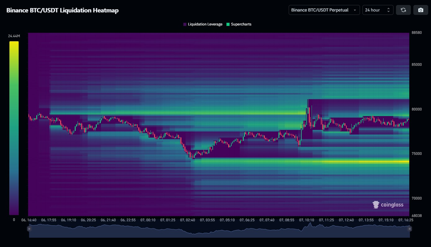
What’s a Liquidation Heatmap?
This picture is like a treasure map for Bitcoin’s price (a place where people trade Bitcoin). The map shows where a lot of people might lose their money if the price of Bitcoin moves up or down a lot. These people are playing a game called “leverage trading,” which is like borrowing extra blocks to build a taller tower…but if the tower falls, they lose everything!
The Colors on the Map
- Purple areas: These are spots where not many people will lose their money. It’s like a quiet playground with not much action.
- Green and yellow areas: These are spots where LOTS of people might lose their money if the price goes there. It’s like a busy playground where everyone’s towers might fall down if someone shakes the ground!
The Numbers on the Side
The numbers on the right side (like $88,580 – $68,038, etc.) are the price of Bitcoin in dollars. So if Bitcoin’s price moves to those numbers, the people who borrowed blocks to build their towers might have to give them back and lose their game.
The Candles (Red and Green Bars)
The red and green bars are like a story of Bitcoin’s price over the last 24 hours (that’s what the “24 hour” at the top means). Green bars mean the price went up, and red bars mean the price went down. The heatmap is showing where people might get in trouble based on how the price has been moving.
How to Use This Map
- If you see a lot of green or yellow at a certain price (like around $70,000), it means that if Bitcoin’s price goes there, a LOT of people might lose their money. This can make the price bounce or drop even more because everyone’s towers are falling at the same time!
- If the price is in a purple area (like above $85,000), not many people will lose their toys, so the price might move more smoothly. However, the key data here is… the timeframe selected.
Why Does This Matter?
This map helps you guess where Bitcoin’s price might have a big fight! If the price gets close to a green or yellow area, it might bounce back or drop fast because so many people are losing their toys. It’s like knowing where the playground might get too crowded and shaky.
Try changing the time from 24 hours , 3 days, 1 Week, 2 Weeks and 1 Month and try to decipher the information along with the Bitcoin Chart😊